
Wednesday, January 23, 2008
Saturday, January 5, 2008

Friday, January 4, 2008
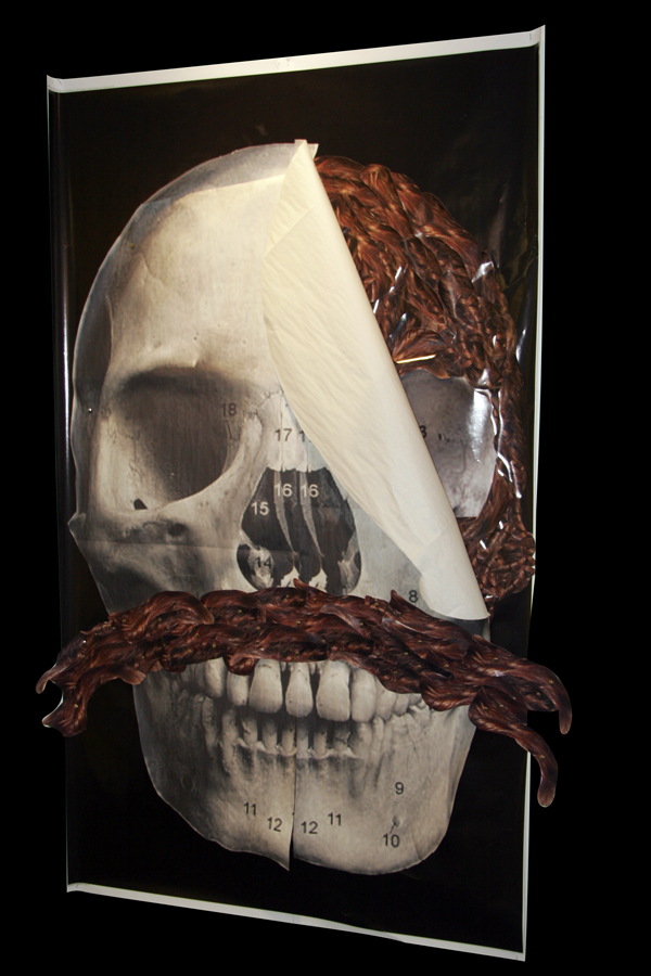
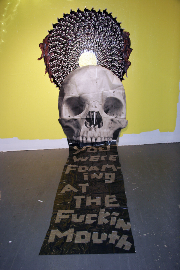
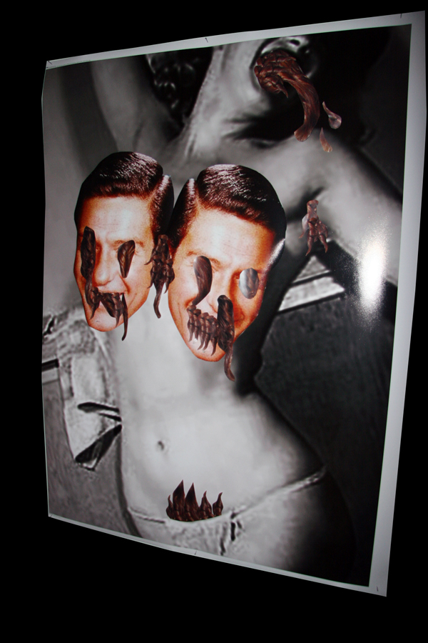
Notes written in my notebook by an esteemed studio visitor
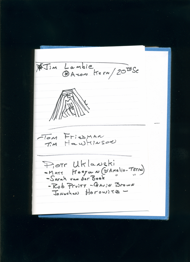
Ok. I get Matt Keegan. He works with collage and text. Some might say his work looks design-y. This is something that I sometimes get too (usually from painters). He does not, it seems, use found photos which is my preference. Some of his procedures relate to the stuff I saw by Collier Schorr at the Contemporary Arts Museum Denver over the Holidays: printing multiple photos, cutting out parts of some photos, laying them loosely over the top of one another. This is an approach to form and material I am messing with too. (What I did not like about Schorr's work is that it reminded me of Wolfgang Tillman.) Keegan's infinite regression piece.... WTF! What can I say about this? I'm currently working on something similar. Fucker. The problem with my found photos is that they are too borrowed. Is Matt Keegan gay? Sam Cady clearly thought I was gay after that studio visit I had with him. That artist he told me about, John O'Reilly, is totally gay. Cady made O'Reilly's work sound better than it is (in my opinion). Cady told me I had to be careful about being too cute. What I don't like about O'Reilly's work is that it is too deliberately "Art" -- and in a literary kind of way too! It makes me think of the side of Jess that I don't like, the poetry side. But anyway, it amuses me that I sometimes get mistaken for being gay. It's all that post-feminist male stuff (and I am certainly a post-feminist male (we are the sons of Alan Alda)). And I know I sometimes tease this mistake out of people. My desire to do this has made me wonder at times if there is something I do not exactly understand about myself but if I'm gay I'm so closeted that I'm not at all in touch with it. But I do love gay culture. Who doesn't? I mean we're talking about the Velvet Underground and the Factory and Andy Warhol and Paul Morrisey films and Lou Reed and John Waters and David Bowie and all of glam (just to name some of the obvious stuff)... Now who doesn't like that stuff? It's a massive part of what constitutes the present.
Rob Pruitt. Oh yeah... I've heard people talk about Rob Pruitt's "101 Art Ideas You Can Do Your Self" (1999) but I had never looked at it. In my opinion it's an updated version of Fluxus -- just provide the score. Fluxus was all about musical scores. I like it this way better than the gallery exhibit version. The e-flux version is also very "net art." It's funny but just now Pruitt's work made me think of Jennifer Sullivan's Powerpoint project, "The Annual Report of My Feelings." Pruitt is clever whereas Sullivan is sincere. But anyway... Rob Pruitt's story may have been a well known one but I did not know it. It's interesting that he was also a victim of Political Correctness Nazis. This of course makes me think of Marilyn Minter. Pruitt's crime however was racism not sexism. I'd seen images of Pruitt's "Cocaine Buffet" but I had no idea it involved real cocaine! Amazing! And this was his comeback, in 1998... It was right after I moved to New York. I was too clueless then to know of this. It's an excellent stunt. Does Aaron Young's "High Performance" refer to "Cocaine Buffet"? Terence Koh's work owes something to this. I'm not sure what I think of Mr. Pruitt's work since "Cocaine Buffet" and "101 Art Ideas." I don't think I buy the whole panda thing or the glitter. Is this work really supposed to be personal? Either there is a huge risk in letting your work become too personal -- despite the fact that we keep being told to do this. It may be that the personal has to be inflected through the public (in other words, Gregory Ulmer's popular register). But merely doing this is not enough. It still has to be done in an interesting way. Or, if not this, Pruitt's panda's are kitsch. And kitsch in the end just ends up being kitsch. And boring kitsch just ends up being boring kitsch. It's just too flat (too much surface). This is a digression but there's a funny line in that Artforum review of Pruitt's show from 2001: "Indeed, if one wanted a material metaphor for an art world about to collapse under the weight of its own fabulous excess, glitter would be the perfect choice." That was 2001! It's 2008 and the collapse has yet to happen still. And glitter keeps on showing up. It's everywhere. Anna Parkina, Meredyth Sparks and Jonathan Hartshorn are three recent artists I've seen playing with it.
Jonathan Horowitz and Rob Pruitt's project "Extreme Houses Visits Peacock Hill," in which they purchased an old house, decorated it and then "exhibited it" (put it up for sale at Gavin Brown Enterprises) is a funny idea. Ken Johnson gave it a bad review though. The devil is in the details. This project, exhibited in 2003, makes me think that the real influence on the the current scene in New York, the whole "Black and Silver Boys" thing is really these artists. They may only precede this scene by a few years but it seems like a glam-style continuation of the same aesthetic. As already noted, Terence Koh clearly owes something to Pruitt but "Extreme Houses" seems like a parody of Banks Violette BEFORE THE FACT. Or, rather, perhaps things are just not changing much and New York really is over. I would have credited Cady Noland and Steven Perrino as being the godmother and godfather of the "Black and Silver Boys" crowd. But now I wonder if Cady Noland owes something to Pruitt's Early work...? Or is it vice versa? Rob Pruitt did an ArtForum top 10 list in 2000. It's clever and cute (too clever perhaps). It's cosmically strange that there is now another Robert Pruitt (Robert A. Pruitt) who has emerged. The new one shows at Clementine Gallery. And he was even in the Whitney Biennial 2006! I don't think the elder Rob Pruitt has been in a Whitney Biennial either. The new Pruitt was one of the shrine people of Whitney Biennial 2006. Is it just me or were there a bunch of shrines in that show? The new Pruitt's work apparently deals with race relations. My guess is that he's African-American. All I have to say is this: strange karma. Actually, I feel kind of bad for Rob Pruitt.
I actually don't get why my esteemed guest compared my work to Rob Pruitt and Jonathan Horowitz. (Maybe he meant the new Pruitt?) Yes, there's the humor... But what else is there? Maybe it was a warning... Matt Keegan makes more sense to me but not these two guys. I would say the same thing about Jim Lambie. One thing that I see is that aesthetic thing we all have in common with Mike Kelley. Mike Kelley is the elder artist of recent times that I've obsessed over. I still do. And it seems to me every white male dude who wasted his youth as a record collector and/or playing in punk bands and then decided to become an artist is also totally into Mike Kelley. It's a problem.
I think I like the humor in Jonathan Horowitz work more than Rob Pruitt's. Pruitt is more of a clown. Horowitz is more of a wit. I would be very interested in seeing some of Horowitz's video work. His aesthetic reminds me of Seth Price's. They both like to employ bad design. They like bad typography. And it usually looks bad because it's totally dated. There is a general anti-aesthetic look to their work. It is clearly supposed to not look like art. Sorry about the repetition here but the more I look at Horowitz and Pruitt's work online, the more I think the "Boys in Black and Silver" are really the new version of what they are/were. They are the next step, the next rung on the ladder (the next car on the night train). The obsession with black and silver in the new kid's work is one of the more distinguishing differences. The new kids are cooler. Horowitz and Pruitt are funnier. The new kids are more overtly glam. And this is really probably the whole retro-80s thing that's raging across the culture (the latest stuttering repetition of culture). Oh, and they are all into partying. Perhaps Horowitz and Pruitt could be described as being somewhere between the smart set (Walker/Price/Guyton/the Reena Spauling's people) and the cocaine crowd (Terence Koh and Banks Violette)-- but with a bigger sense of humor. Considering their association with Gavin Brown (i.e., the bar Passerby) this makes psycho-socio-politico sense. All of these artists are "conceptual" in a similar way. And they all pride themselves in knowing a lot about art since 1966.
I saw Sara VanDerBeek show in the project room at D'Amelio Terras. It was okay. I was actually not too crazy about her work. This is a perfect example of the sort of work that I pay attention to because someone is pointing their finger at it. (For example, go where many people are gathered and flamboyantly point at nothing; you can get a lot of people to look at nothing; it's funny.) Formally it looked a bit too familiar to me. The content was too opaque. It seemed to have a bunch of references to art history. If pressed to say what the work is about, I would say, "art history." Joao Ribas in a lecture to the MFA Fine Arts Program at SVA argued that one of the main reasons there is so much political art is because artists think that if they refer to "the political" it will make their art seem more serious. I think he is totally right on with this. But there is another way artists gesture towards their seriousness. Perhaps it is the new way (the cool kids definitely tend to use it). They show how serious they are with references to art history. The more obscure the references are, the smarter the artist is (natch).
Tom Friedman is the only artist on this list whose work I am into. His work amazes me. Friedman and Pruitt might be the older brothers to the "Boys and Black and Silver"'s younger brothers. In terms of age, well, I'm one of the middle brothers.
Did Piotr Uklanski move from Gavin Brown to Gagosian Gallery? If so then three of these artists used to be associated with Gavin Brown (Pruitt, Horowitz (both of whom still are)) and Uklanski. Keegan and VanDerBeek have associations with D'Amelio Terras. Jim Lambie is with Anton Kern. Tom Friedman used to show at Feature (a gallery that fascinates me more than most -- even though I do not always like what they show) but now he moved over to the Gagosian Gallery as well.
Not counting Tom Friedman (because he is in a special class for me) esthetically I am most attracted to Jim Lambie's work. What I am talking about is the part of his aesthetic that overlaps with the Pierogi aesthetic. Jim Lambie is the collision of a Banks Violette-ish iconography with the Pierogi obsessive/compulsive thing.
Subscribe to:
Posts (Atom)